
Siteflow for RealWear: Imaginging a hands-free intervention experience
How might we simplify the way field operators undertake industrial interventions through hands-free access to and documentation of vital information?

User Experience Design
User Research
User Interface Design
CLIENT
Siteflow, a cloud-based software digitalising field operations in heavy and sensitive industries
SCOPE
A 3-month research project that validates the user needs, frames the potential challenges and explores design solutions, culminating in a case study report and a promotional video to be presented at WNE (World Nuclear Exhibition)
MY ROLE
I was responsible for undertaking the entire research project from the discovery research phase through to the prototype and user testing, then presenting the findings to the stakeholders. Supported by the design manager of Siteflow.
TOOLS
Figma, Figjam, Jira, Teams, RealWear Explorer
Project Background & Context
WHAT IS SITEFLOW?
Siteflow is a cloud-based software designed for complex industries, primarily serving the highly regulated nuclear energy sector. It connects offsite engineers and onsite field operators, streamlining industrial interventions from preparation, through execution, to closing documentation.
At the forefront of innovation and digitalisation in its industry, Siteflow saw an opportunity to bring their solution to users in a hands-free context through Realwear's head-worn smart device, allowing field operators to focus on the task at hand without the hindrance of papers, binders or tablets.


WHAT IS REALWEAR?
RealWear is an assisted reality (aR) headset solution that provides its wearer with an industrial-strength, hands-free, voice-command-operated smart device.
The lightweight wearable can be mounted on a hardhat or worn directly on the head, while accommodating other personal protective equipment. Unlike broader consumer smart glasses which are often binocular, this monocular device ensures the user is still fully aware of their surroundings (essential in industrial environments) as the small screen sits just below their eyeline.
RealWear, and other products like it, have shaken up heavy industry, allowing workers to be more connected than ever before.
WHAT WERE THE PROJECT GOALS?

WHAT WAS THE PROJECT'S RESEARCH APPROACH?
This project primarily focused on research in order to build an initial prototype. The research phase was broken into three separate, yet interlinked, topics to explore and uncover insights that would help guide and frame the overall problem. First, it was essential to understand the general user within this technical space. Following this, understanding Siteflow's functionality and features would illustrate how the existing MobileApp is responding to the needs of the user as well as highlight any pain point areas which could present opportunities that RealWear might address. Lastly, all of this would need to fit within the capabilities (and constraints!) posed by the RealWear device, in particular how the interface would adapt to be voice-operated and hands-free.
.png)
User Needs & Expectations
DEFINING SITEFLOW'S USERS
Within Siteflow's user structure, it could not be ignored that consideration must be taken for both the client - the heavy industry companies who ultimately decide to implement the use of the software in the field - and the end users - the engineers and field operators who interact with the software.
In the case of adapting the solution to the RealWear device, the usability concerns primarily affect the field operator, and so they became the initial focus during the user research phase.

BUILDING A PROTO-PERSONA
Due to the sensitive nature of heavy industry clients, I was only able to build a proto-persona based off of characteristics, known insights and some assumptions gathered from Siteflow's internal delivery managers who have extensive experience with both clients and field operators.
It still proved to be a useful tool to establish many central dimensions that helped ensure we were designing with an understanding of what drives the persona, what they need and what gets in the way of those needs.
Hover over the stickies to get an overview...


Through creating a proto-persona, I understood that users prioritise efficiency over the specific tool, with a likely preference for traditional paper-based methods due to familiarity. To transition to a digital solution like Siteflow (even on a tablet!), users need to perceive immediate and tangible benefits through frictionless interactions to overcome the hurdle of adapting to something new.
MAPPING THE USER JOURNEY
By tracking a basic 2-week intervention, comprising multiple common tasks while using Siteflow's MobileApp, I was able to define pain points derived from the proto-persona's traditional way of carrying out interventions and how Siteflow has answered these, as well as where technology and digitalisation has caused stress or challenges. It also helped illustrate where the RealWear device has opportunities to make a difference in the journey.
Hover over each action for more details...


PRIORITISING THE CLIENT'S NEEDS
Although understanding the end user was prioritised as the key to ensuring a smooth implementation of the Siteflow solution onto RealWear, we could not ignore taking into account Siteflow's clients' needs. At the end of the day, the client has the most to gain from the digitisation of their processes and they are the ultimate decision makers on whether to deploy this transition.
During the research phase and the following ideation phase, a disparity arose between the needs of the clients in certain sectors with high sensitivity and those with looser regulations, particularly around collecting physical signatures (a fundamental part of traceability during interventions in many sectors). Based on the two client types that emerged, we had to take a business decision to prioritise either full-functionality or simplification for efficiency.

Bearing in mind what was uncovered during the persona and journey mapping exercises, we understood that simplicity should indeed be at the forefront of the solution, so the decision was to opt for the feature prioritisation of efficiency, to strip out some functionality so that the RealWear solution would not depend on other devices. Of course, if the solution were to be deployed and further developed, there would always be room to build on this and offer a more complete functionality for clients that required it.
The takeaway from user research:
It is essential that the RealWear solution remains as familiar as possible to Siteflow's MobileApp to reduce the the learning curve and encourage quick adoption, while also aiming to reduce friction by simplifying its functions through prioritising efficiency.
Breaking down Siteflow's Features
THE SOFTWARE'S MAIN FUNCTIONALITY
In order to understand what functionality needed to be translated across to RealWear, it was essential to take stock of the the key functionality provided by Siteflow's MobileApp. This is primarily around sharing information (which was traditionally done through papers and binders) about equipment, team members, risks, and task instructions to the field operator at the relevant time during the intervention process. In return, the field operator can also send back collected data and log information to increase traceability of how the project was carried out (again, which was traditionally done through paper processes).


INVENTORISING INPUT METHODS
As the eventual RealWear solution would have completely new voice-operated input methods, an early exercise to help understand the task of translating Siteflow's MobileApp was to inventorise all the different interaction input methods that are currently used and to identify which were primary (most common / essential) and which would pose challenges.
Vertical scrolling stood out as a big potential challenge. In RealWear, to scroll through a page, the user speaks the voice command "Page Up" or "Page Down" and the screen moves within the viewport by a defined interval in that direction. The result is scrolling to the bottom of a long page would require many voice commands - a clunky and imprecise experience that could make vertical navigation a potential pain point.
On the other hand, photo-taking and QR code scanning are less-often used input methods on the MobileApp but could excel with RealWear since the device has a built in camera and could potentially improve the user experience.
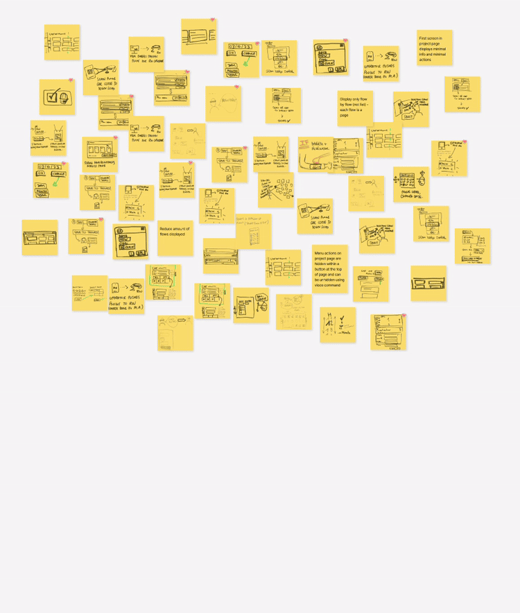
BUILDING USER FLOWS
Going one layer deeper into the app, a handful of the most critical main tasks were selected to breakdown further into user flows. This highlighted within each task how many pages the user would navigate through, how many decisions they had to make and how many actions would be involved to successfully complete it. (These flows focused on the "happy path" to begin with.)

Through this exercise, a picture emerged of which flows involved many actions, essentially meaning a higher level of friction to successfully complete the task, especially if we consider that these actions will translate to a voice-command in RealWear. Additionally, it showed which flows required multiple decisions, equating to additional mental load in completing the task (and therefore reduced efficiency).
Below are three further examples of user flows, simplified with the text removed to illustrate how a seemingly straight forward task like inputting a date or adding a signature in the MobileApp actually involves quite a few decisions and actions. Since they were the most complicated, these three tasks were selected to ideate around how we could simplify their decisions and actions in the context of RealWear's capabilities.

IDEATING IN A CO-CREATION WORKSHOP
To start ideating around the challenges faced by adapting Siteflow's MobileApp onto RealWear, a co-creation workshop was organised amongst Siteflow's design team, a delivery manager and a product owner.
Presented with a problem statement and it's corresponding 'How Might We' question, the team generated dozens of concepts ranging from completely out-there (and not necessarily feasible) to making minor adjustments to the existing software. Three core themes emerged which helped form further guidance in the following design phase.
(In the example problem statement to the right, a 'flow' is like a sub-section of a larger project.)

Out of these three themes, there was concern that dependency of RealWear on the MobileApp/WebApp would introduce complications and friction to the solution. This direction was discussed with stakeholders in a following meeting (see Prioritising the Client's Needs section) and priority was given to ensuring the RealWear solution could stand alone - so these concepts were put aside for the time being.
On the other hand, the themes of Simplification and New Interactions formed the basis for the outcome of this project.

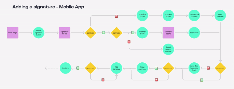
Building off of the simplification of screens and introducing new interactions, here is an example of how I transformed one of the user flows explored - adding a signature to a form - from the MobileApp to RealWear. It simplifies the entire process by narrowing down the path the user is able to take. Friction is decreased by reducing the number of call-to-action buttons per page, which guides the user through the flow very precisely by progressively disclosing information. The mental load is also reduced by decreasing the number of decisions the user has to make down to just one.
The takeaway from analysing Siteflow's features:
Simplify the interface by reducing the number of decisions the user must make, while also decluttering the interface through removing unnecessary elements.
Understanding RealWear's Capabilities
GATHERING REALWEAR'S PRODUCT SPECIFICATIONS
The final piece of the puzzle was to delve into both the hardware and software of the RealWear devices.
One of the key elements to understand on this device is the display that is being designed for. As a monocular screen (viewable from the user's dominant eye), there were several key takeaways from gathering the display specifications.


Second to the display was understanding how the voice commands work and what design considerations existed around them. RealWear works on the "Say What You See" principle, meaning any button with text can be activated by simply saying that text aloud. Elements that don't have text (such as buttons with only icons, or cards) would have RealWear's proprietary markup language, WearML, applied to it. By detecting interactive objects that don't have text commands, it overlays a numbered bubble overtop which allows the user to interact with it through the voice command "Select Item [#]".
ANALYSING REALWEAR'S SOFTWARE MARKETPLACE
RealWear already hosts over 200+ applications on its devoted marketplace, so it was the first port of call to uncover what existing software was available, what kinds of features and functions they offered and how they tackled the challenges around voice-activated and hands-free interfaces.
Amongst the 200 apps, they primarily fell across four categories: remote assistance, workflow instruction & documentation, training, and inspection. Compared to Siteflow's in-depth functionality that caters to the nuclear industry, these were mostly focused on simpler tasks, such as being able to connect field operators to offsite experts on a call to aide with intervention processes.
This was also the opportunity to take stock of how the interfaces were put together. With the understanding of Siteflow's user needs and expectations of bringing simplification to the screens, it allowed for a deeper dive into analysing the "do's" and "don'ts" of what solutions could be developed.
Hover over the highlighted sections to reveal my thoughts on what is working and what isn't in the competitor software interfaces below.


DEVELOPING GUIDING PRINCIPLES
The gathered research findings were applied as design principles onto one of Siteflow's main screens (the "Project List Page") to illustrate how the interface would need to change and adapt. See how the screen changes with each added principle.
Switching from portrait to landscape means the distribution of elements is completely different and scroll behaviour is impacted.
Limited screen space means we have to consider the hierarchy of information displayed on each page.
All buttons must have a visible voice command in order to intuitively interact with it.
Some buttons will need "WearML" applied to them for clarity of use (repeated commands and cards, for example).
Adapt the landscape screen orientation by introducing horizontal scrolling for a more ergonomic way to navigate through information.
1.
2.
3.
4.
5.
The takeaway from understanding RealWear's capabilities:
The learnings from researching RealWear's hardware and software landscape formed 5 guiding principles around space and button constraints to ensure a smooth and erganomic user interface when operated through voice commands.
Building a Considered Solution
PUTTING THE PUZZLE PIECES TOGETHER
Armed with an understanding across the three main topics of the challenge and how they affect each other, the next step was to apply the gathered information to develop a RealWear version of the identified "happy path". Initially through sketch prototyping, this was explored loosely before moving into mid- and hi-fidelity wireframes, which were used for testing. The iterative prototyping process meant that the design was continuously evolving based on input from internal user testing and from Siteflow stakeholders.


CONDUCTING USER TESTING
In order to progress from one prototype version to another and move through the iterative process, it was necessary to carry out user testing as often as possible. This ensured that every subsequent design decision that was being made was based on common feedback coming from the majority of test participants.
Due to time constraints and security issues, it was not possible to perform any testing with actual end users. Instead, two rounds of internal testing was carried out with Siteflow team members who have an understanding of the MobileApp's functions, requirements and users.
Both rounds were structured similarly, where the users were given time to get adjusted to the hardware before they were given bite-sized tasks to complete and to talk through their experiences in carrying them out.


ITERATING THROUGH PROTOTYPING
To help illustrate the evolution through versions, here is a breakdown of how the "Project List Page" (the first page you see when you login to Siteflow) changed across each of the four versions, where different feedback was taken onboard through internal user testing and team decisions. (To see how this differs from the existing MobileApp's version of this screen, see Developing Guiding Principles section.)
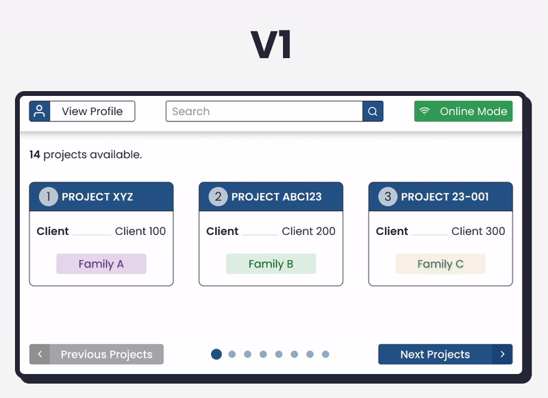


Version 1:
-
The horizontal navigation was established, along with "previous" and "next" buttons and an indicator to show where the user is within the content.
-
WearML bubbles were applied to each Project Card, and the cards only show the most essential information.
-
The header of the screen remains nearly the same as the MobileApp.
Version 2:
-
The navigation buttons were toned-down to differentiate them further from main call-to-cation buttons.
-
The WearML bubbles were pulled out of the Project Cards and placed 'on top' in order to make them stand out more obviously.
-
The space was utilised more efficiently by increasing the size of the cards to allow for longer project titles and client names.
-
The colour was removed from the header of the Project Card in an attempt to differentiate them from Flow Cards (which appear on the following page, once a Project is selected and opened).
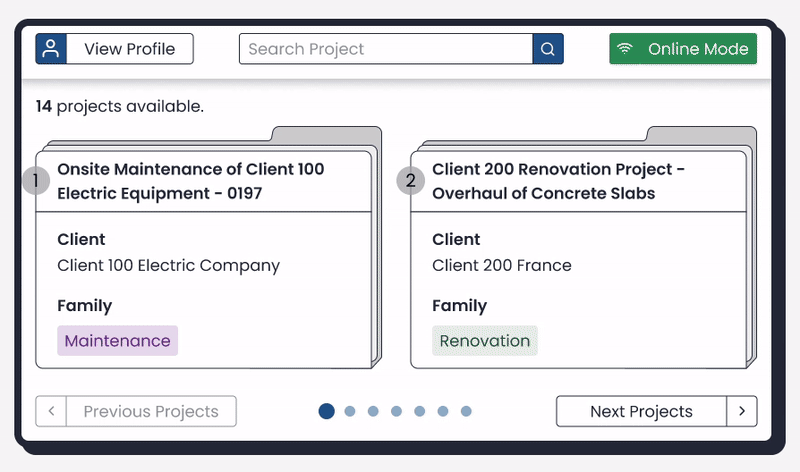
Version 3:
-
Project Cards were enlarged even further, and reduced down to displaying only 2 per screen in order to allow for enough space for lengthier titles (which is common).

Version 4:
-
Finally, the Project Card was differentiated even further from the Flow Cards by visualising them into the form of folders, which also helped convey to the user that they hold further information within them.
FINAL FUNCTIONALITY AT A GLANCE
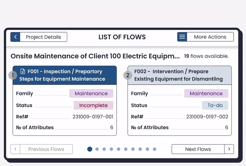
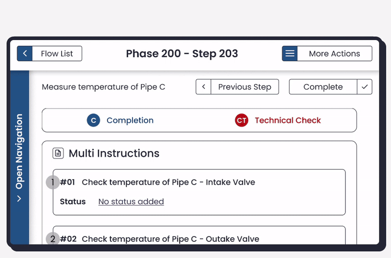
To give an idea of how the last prototype version came together, taking into account all the research, guiding principles and testing results, below is a selection of common actions within Siteflow shown with the re-designed RealWear interface and enabled through voice-commands.
Opening a project & downloading a flow for offline viewing.
Navigating through the steps of a flow.
Adding a 'signature' to a step using a QR code.
PROJECT OUTCOME
The culmination of the three months of research, prototyping & testing was a video presentation summarising the project, which aired on Siteflow's World Nuclear Expo (WNE) stand in Paris in November 2023 to highlight the possibilities ahead for nuclear intervention digitalisation. Throughout the three-day expo, existing and prospective Siteflow clients showed interest in harnessing this hands-free technology to bring improved efficiency to their workflows. Siteflow continues to explore this route ahead, now with the backing and support of big players in the nuclear industry.

Shout out to Etienne, Mariane, François, Océane & Yann who collaborated to create this video.
Through researching, designing, and testing, Siteflow has taken the first step in adding their voice and unique perspective to the smart device conversation around how this technology can be leveraged in today's industrial revolution.
So, what's next?
REMAINING CHALLENGES TO EXPLORE
Although the outcome of these initial designing and testing phases were generally positive, there still remains a huge challenge around the wider adaptation of new technologies, especially for devices that require a whole new means of interaction (that being voice-commands). The pushback that has been experienced around introducing a mobile/tablet onto the field illustrates the uphill battle there is for hardware that is even more abstracted from the traditional pen-and-paper methodology.


During the user testing phase, the biggest and most common pain points had nothing to do with the interface design on screen, but in fact everything to do with the hardware. Test participants struggled to get the screen lined up properly with their dominant eye, so they either found themselves winking the other eye to compensate, or were constantly readjusting the screen to ensure they could see all of it clearly (not ideal when this is meant to be a hands-free device!). With time, it is normal to adapt and get better at lining up the device properly so the whole screen is clear, but as an initial experience it has the potential to really throw users off and make them give up on using the device, even if it has many positive benefits.
In addition, something that was harder to test with the prototype since the true voice-command functionality did not work yet, but was experienced through separate device testing, was the actual voice recognition. Another frustration some participants experienced was the device not understanding their voice commands, or even registering them at all. When the user has to repeat a command several times just to perform one action ("Select Item 1", for example), they may end up abandoning the technology fairly quickly.
Deeper research and user testing could be done with existing users of the RealWear device to understand what pain points they experienced when they first started using it, and how they overcame them. Working together with the RealWear team itself, with the shared aim of increasing the adoption of the product, could also be useful in sharing design best-practice tips. Armed with these useful insights, Siteflow can build a robust training plan for all their new users of this technology to ensure they hit the ground running, and have ways to mitigate adoption hiccups before they become a true pain point.
Part of Siteflow's solution when introducing its software onto RealWear will require finding ways to minimise any hardware pain points to avoid the solution being abandoned before the user can adapt and experience the full benefits.
THIS IS JUST THE TIP OF THE ICEBERG...
This research project was only the first step in developing a full and complete solution to translate Siteflow onto RealWear. It acts as a good base to build future iterations from as well as a point of reference for design decisions going forward, however there is still plenty of work to be done to make the full translation an ergonomic reality. Below is a list of some crucial next steps that would need to be undertaken in order to progress the project.


Thanks for reading.

SEE MORE PROJECTS
User Interface Design • Heuristics Analysis • Wireframe Prototyping
User Research • User Experience Design • User Interface Design
User Research & Testing • Product Development • Project Management
User Research • User Experience Design • User Interface Design